

The national teacher shortage is a well-documented crisis, with causes ranging from policy barriers to shifting workforce dynamics. While some solutions require action at the state or federal level, such as changes to licensure requirements or pathways into the profession, these levers are often out of reach for local school districts facing urgent staffing needs. Advocacy has its place, but when classrooms sit empty, district leaders need practical strategies they can implement now.
That’s why many districts are taking a more proactive approach, launching Grow-Your-Own programs, rethinking recruitment tactics, or even partnering on housing solutions for educators. But the success of these efforts hinges on one critical factor: understanding the local data. Without a clear grasp of why teachers are leaving or why applicants aren’t accepting offers, districts risk investing in solutions that miss the mark. Grounding decisions in local data helps leaders move from guesswork to targeted action.
Examining the local pipeline
Recruiting and retaining effective teachers isn’t a single event, it’s a process with many stages, each of which presents opportunities and challenges. District leaders can gain powerful insights by breaking the process down and examining what’s happening at each point along the local pipeline.
Below are some key stages in the educator journey. Any one of them could be a strength to build on, or a bottleneck that needs attention.
1. Local Students Entering the Teaching Profession
- How many students from your own district are choosing to pursue teaching?
- Are there Grow-Your-Own programs or partnerships in place to support and expand this pipeline?
2. Current Teachers Leaving the Classroom
- What reasons are teachers giving for leaving?
- Are exit interviews being conducted and analyzed?
- Can trends be anticipated based on role, experience, or school site?
3. Position Advertising
- Through which platforms are teaching positions being advertised?
- Do you track which methods yield the strongest applicant pools?
- Is your messaging consistent and tailored to different audiences?
4. Applications Received
- How many applications are you receiving per posting?
- What do you know about where applicants are coming from—geographically or professionally?
5. Initial Screening
- What percentage of applicants meet your baseline criteria?
- What common barriers prevent otherwise promising candidates from moving forward?
6. Participation in Interviews
- How many candidates make it to the interview stage?
- Are there steps in the process that may unintentionally deter candidates?
7. Job Offers Extended
- How many offers are being made?
- Is your offer process competitive in terms of timing, compensation, and benefits?
8. Offers Accepted
- What’s your offer acceptance rate?
- If candidates decline, do you understand why?
9. Retention at 3 Years
- What percentage of new hires are still teaching in your district after three years?
- Are there differences by school, subject area, or mentoring support?
10. Retention at 5 Years
- What patterns exist among teachers who stay for five years or more?
- Does retention correlate with compensation, leadership opportunities, or professional development?
Visualizing your pipeline
Turning raw data into clear visuals can unlock powerful insights. Charts and graphs help uncover patterns that might otherwise go unnoticed and make complex processes easier to understand. The type of visualization you choose should align with both the data you have and the specific questions you want to answer.
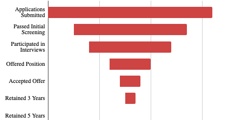
Funnel Chart
A funnel chart is simply just a bar chart organized to appear as a funnel, showing how the pool narrows as time goes on. I created this simple one in Google Sheets.
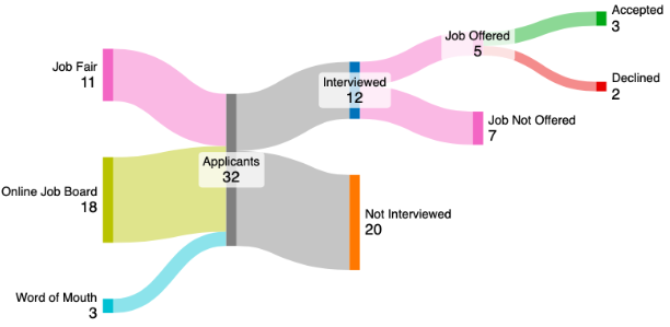
Sankey Diagram
A Sankey diagram showcases the flow of data from one point to the next. This is a great method for visualizing the number of candidates at each point in the process and what ends up happening to them. I mocked up this sample using sankeymatic.com.
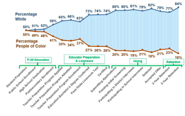
Dual-Axis Line Chart
In my time at the American Institutes for Research (AIR), we would often conduct analyses of the teacher diversity gap by showcasing the progression of the gap throughout the full process. Here is a sample chart from AIR’s Center for Great Teachers and Leaders.
Digging deeper into the data
Recruitment and retention touches many different corners of a district so it is imperative that district leaders engage numerous different perspectives in the analysis of the problems. This is an opportunity to utilize a data analysis protocol that capitalizes on the diverse minds in the district and ensures that all voices are heard. I recommend the Collective Wisdom Data Analysis Protocol.
Knowing exactly what questions you are trying to answer is essential to the process, as well. In 2022, the Region 8 Comprehensive Center put out this resource to assist with strategic usage of local recruitment and retention data. They provided key questions to ask and data sources that might be useful to answer the questions:
| Key Questions | Potential Data to Use |
| What are historical trends in terms of recruitment, hiring, and retention? | Number of retirements in the past 3 yearsPrevious pipelines/pathways that have led to successful new hires |
| What are anticipated needs for next year? For the next 3 years? | Anticipated number of retirementsAnticipated number of leavers (staff leaving for reasons other than retirement)Anticipated student enrollment changesAnticipated changes in demand for services and programming (e.g., special education services, teachers of multilingual learners, dual credit educators, social services, career and technical education [CTE] programming) |
| Which students have access to highly effective teachers within the building/district? What trends do you see? | Distribution of highly effective/effective teachers across and within schoolsDistribution of teachers by race, ethnicity, gender across and within schools |
| What does the applicant pool look like for each posted position? | Diversity of applicantsApplicant sourceApplicant volumeApplicants per vacancy (by type and school) |
| Where are there bottlenecks in the process? | Processing timeInterview schedulesVacancy fill rates |
| Which recruitment methods were most successful? How do you know? | Applicant sourcesConversion ratesOnboarding interview data |
| Where were there bottlenecks in the process and why did they exist? | Processing timeVacancy fill ratesProcess debriefs with human resources (HR) staff, principals, and new hires |
| Are the teachers we hire effective? Which teacher attributes of performance were most indicative of future performance? | Student performance dataTeacher evaluation ratingsHiring process data (e.g., application, performance measures, interview data, applicant source) |
| Do the teachers we hire stay? Why or why not? What trends do we see in the data? | Teacher persistenceDemographic information of leavers and stayersReasons new hires leaveWhere new hires go after they leave (e.g., another district, another profession)Supports provided to new hiresWhich new hires receive support and from whom |
Conducting a root cause analysis
Once districts collect data across the teacher pipeline, the next critical step is moving beyond surface-level observations to uncover the why behind the numbers. This is where root cause analysis (RCA) comes in. RCA is a systematic process for identifying the underlying reasons a problem exists so that interventions target the real issue, not just its symptoms.
For example, a district may see that a large number of applicants fail to pass the initial screening. The surface-level conclusion might be: “We need more applicants.” But a deeper analysis might reveal that applicants are routinely missing key certification requirements, suggesting that the district needs to build relationships with teacher prep programs or expand alternative certification pathways. Without RCA, efforts could focus on advertising instead of aligning qualifications.
To begin a root cause analysis, start by selecting a problem area in your pipeline where the data signals a major drop-off or concern. Then use tools like the “5 Whys” method, asking “why?” repeatedly to drill down past the immediate explanation. Pair this with stakeholder interviews, focus groups, or process mapping to validate assumptions and get multiple perspectives.
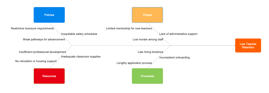
Visual tools can help as well. A fishbone diagram (also called an Ishikawa diagram) can be a powerful way to organize contributing factors across categories like people, policy, resources, and process. This allows leaders to see how issues like lack of mentor support, late hiring timelines, or poor communication with candidates might intersect and compound.
By identifying the root causes of local recruitment and retention challenges, districts can stop spinning their wheels and start investing in strategic, evidence-based solutions. It’s not just about more data; it’s about smarter decisions driven by understanding what’s really happening beneath the surface.
Next Steps
Understanding your district’s teacher recruitment and retention pipeline is just the beginning. The next step is to take action. Identify one or two points in the pipeline where your data shows the greatest need or opportunity. Begin gathering more targeted data, involve stakeholders who can offer insight, and pilot small changes to see what moves the needle. Whether it’s strengthening local partnerships, improving your interview process, or supporting early-career teachers, progress starts with informed, intentional steps. Use your local data not just to diagnose challenges, but to drive smarter, more sustainable solutions.
Be sure to check out my free ebook, 10 AI Prompts Every School Leader Can Use to Boost Data-Driven Decision Making.